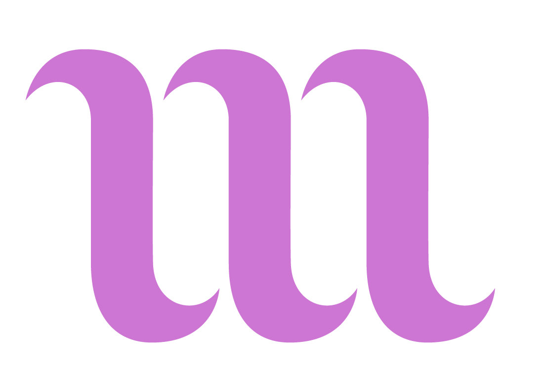
This project consisted in the naming and visual identity for a brand of gin. The concept created reflects he paradox of tradition and modernity, while also keeping the playful and elegant spirit associated with gin.
This visual identity was designed around the concept of a "classic with a twist". Gin is a drink that has both a timeless and contemporary essence, so the focus of this project consisted in the marriage of these two seemingly opposing ideas. This was achieved by combining vintage typographic and illustration styles with a modern approach. The euphoric and liberating feelings that spring from drinking gin were also considered in this design and are reflected in the woman standing upside down, dancing as she seems to dive into a glass of gin.
The inspiration for the name of the brand came from the first line of a poem written in the 18th century by William Maginn during the Gin Craze, to pay homage to the early days of the drink and bring in a sense of nostalgia. However, the vectorized style of the brand mark and the minimalistic use of color helps to keep part of the identity tied to the present, infusing the brand with a sense of time travel.
