Case Snapshot
Product: Digital platform connecting car owners with automotive workshops
Role: UX/UI Designer & User Researcher
Timeline: Multi-phase, Agile development
Team: Product team, developers team, design team later expanded to include additional designers
Platform: Web-based marketplace platform 
Users: End users: Car owners // Service providers: Automotive workshops

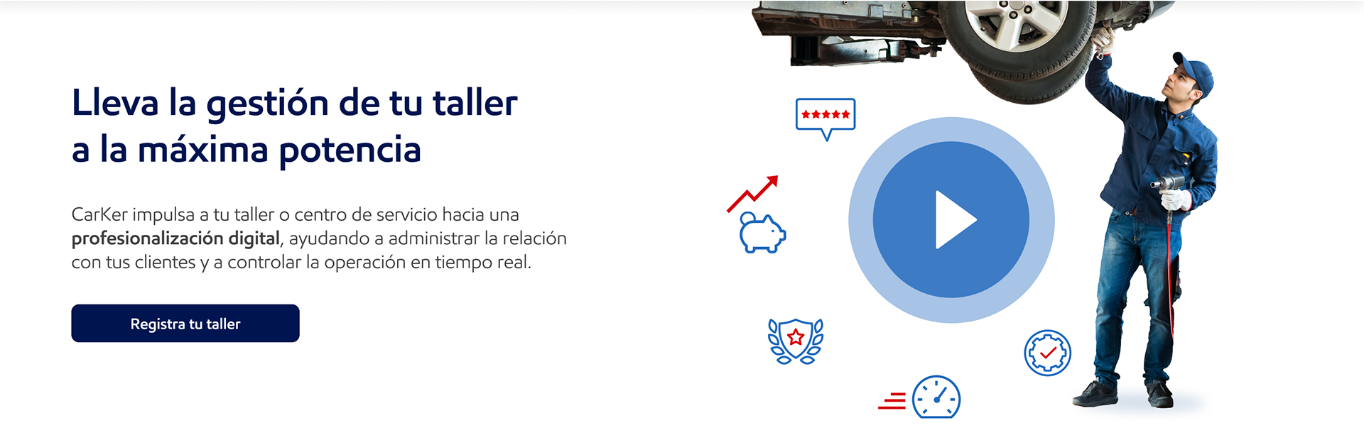
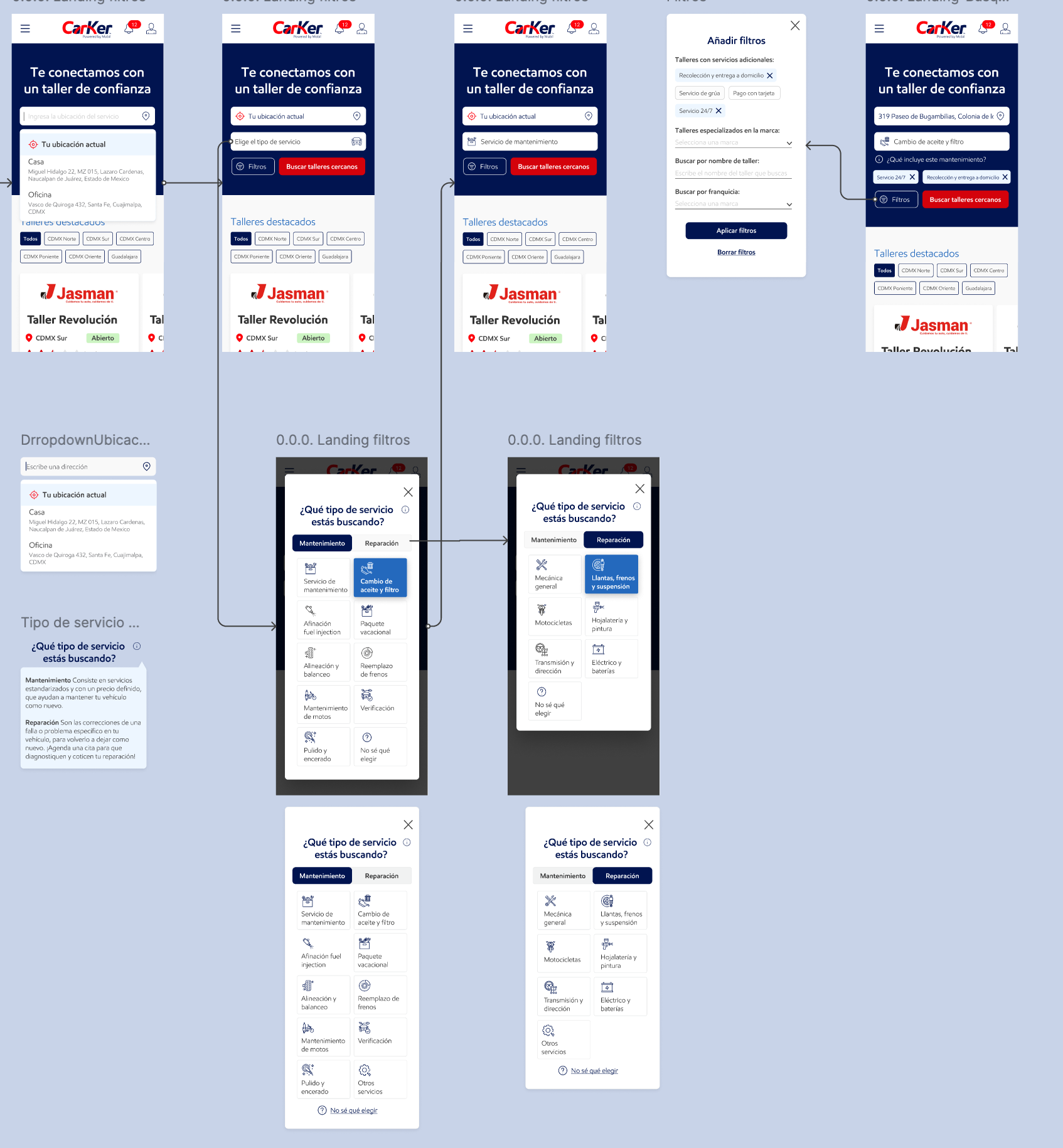
The landing page for workshop registration was redesigned to communicate the value the service could bring to their process.

Translation: Headline-Shift your workshop management into high gear.  Secondary text- Boost your workshop or service center towards a digital professionalization, helping you manage your client relations and control your operation in real time. CTA- Register your workshop

Challenge: The platform contained high complexity and low adoption risk due to traditional workflows in car workshops, no perceived differential value for end users. 
Outcome: Delivered a simplified, more intuitive platform aligned with real workshop routines, while building a scalable UI foundation under tight time and resource constraints. This helped deliver real value not only to car owners, but also to the automotive workshops listed on the platform, to give them a reason beyond visibility to use the service. 
Product lens: This project influenced the roadmap by validating what car workshop operators and end users where really looking for to improve their experience. It also helped understand what the MVP should be focused on to avoid getting distracted by feature nausea and only focus on what could truly bring value to potential clients, helping refine the business value proposition and validate product market fit and make sure they were offering a real solution.
Problem & why it mattered
Context:
The platform aimed to modernize how car owners book services and how workshops manage jobs. However, workshops, the backbone of the system, operate under high time pressure, fragmented workflows, and strong resistance to change.
If the product simply replicated the traditional, offline process in a digital interface, it would fail to justify adoption. 
For the platform to succeed, it needed to:
• Feel intuitive and trustworthy to end users
• Integrate seamlessly into existing workshop routines
• Reduce friction without adding operational burden
This made simplification, not feature expansion, the core challenge
Success metrics:
• How many functionalities where rated as valuable to workshops
• End consumer effort rating in finding the service they need
• Number of screens (to measure simplification of user flows)
​​​

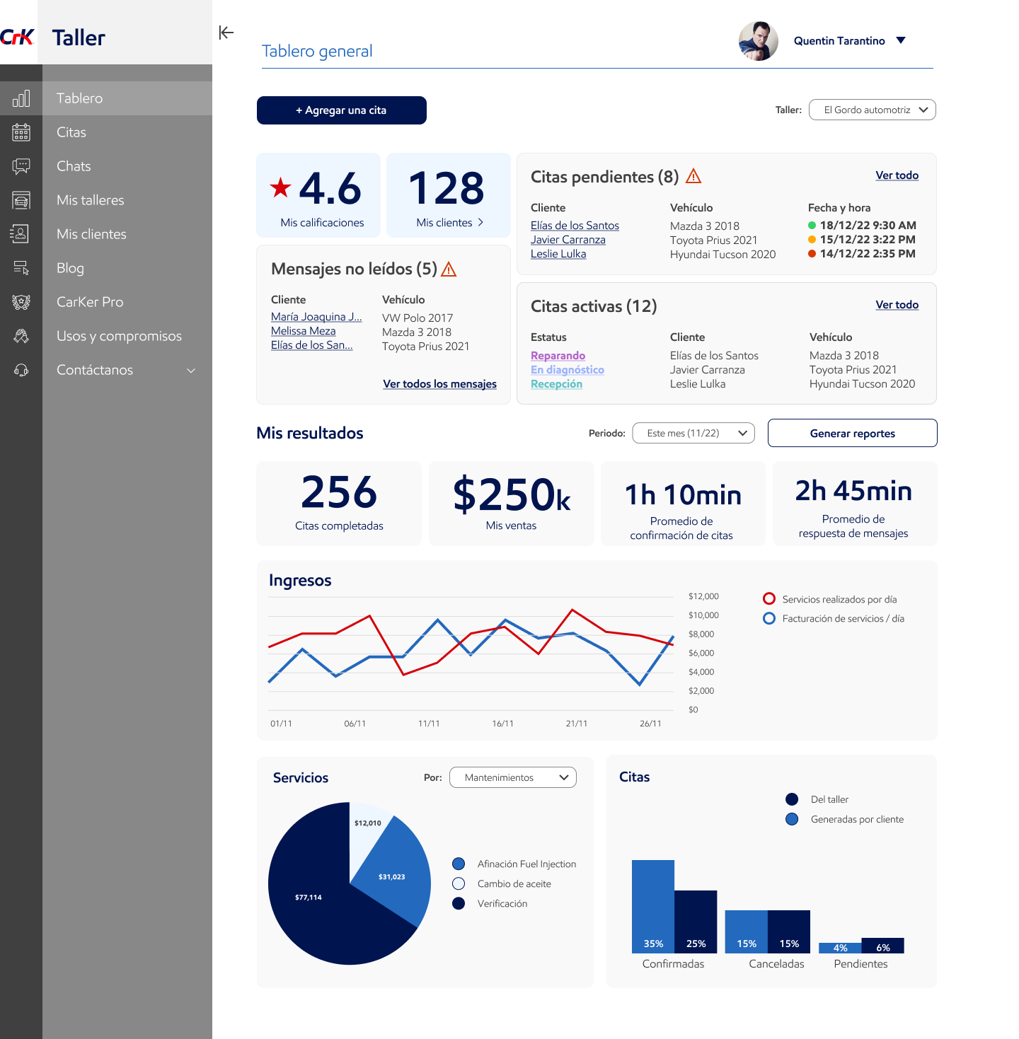
The most importance metrics for the operation and management where validated with workshop owners to only show information of value to them, not more and not less.
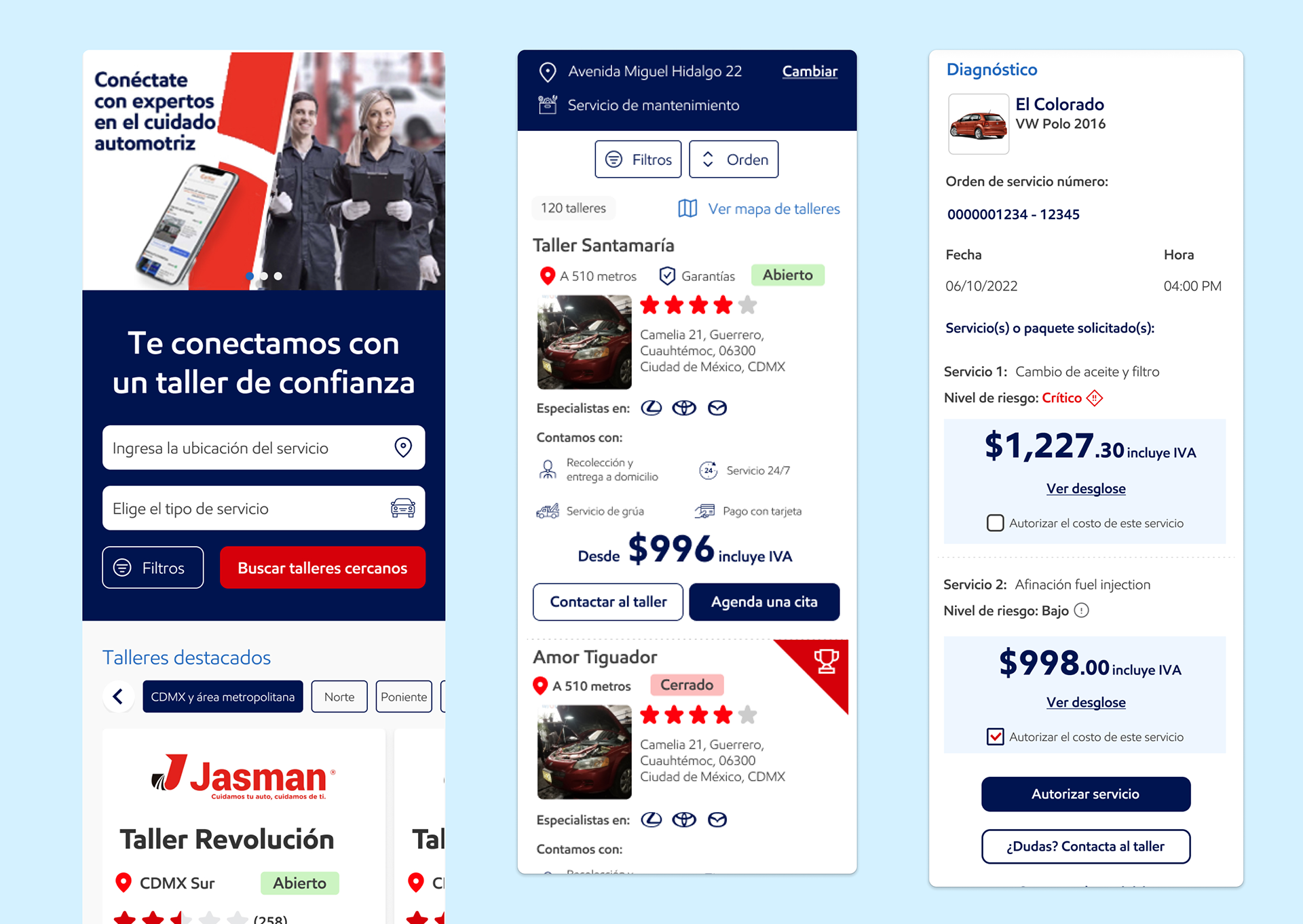
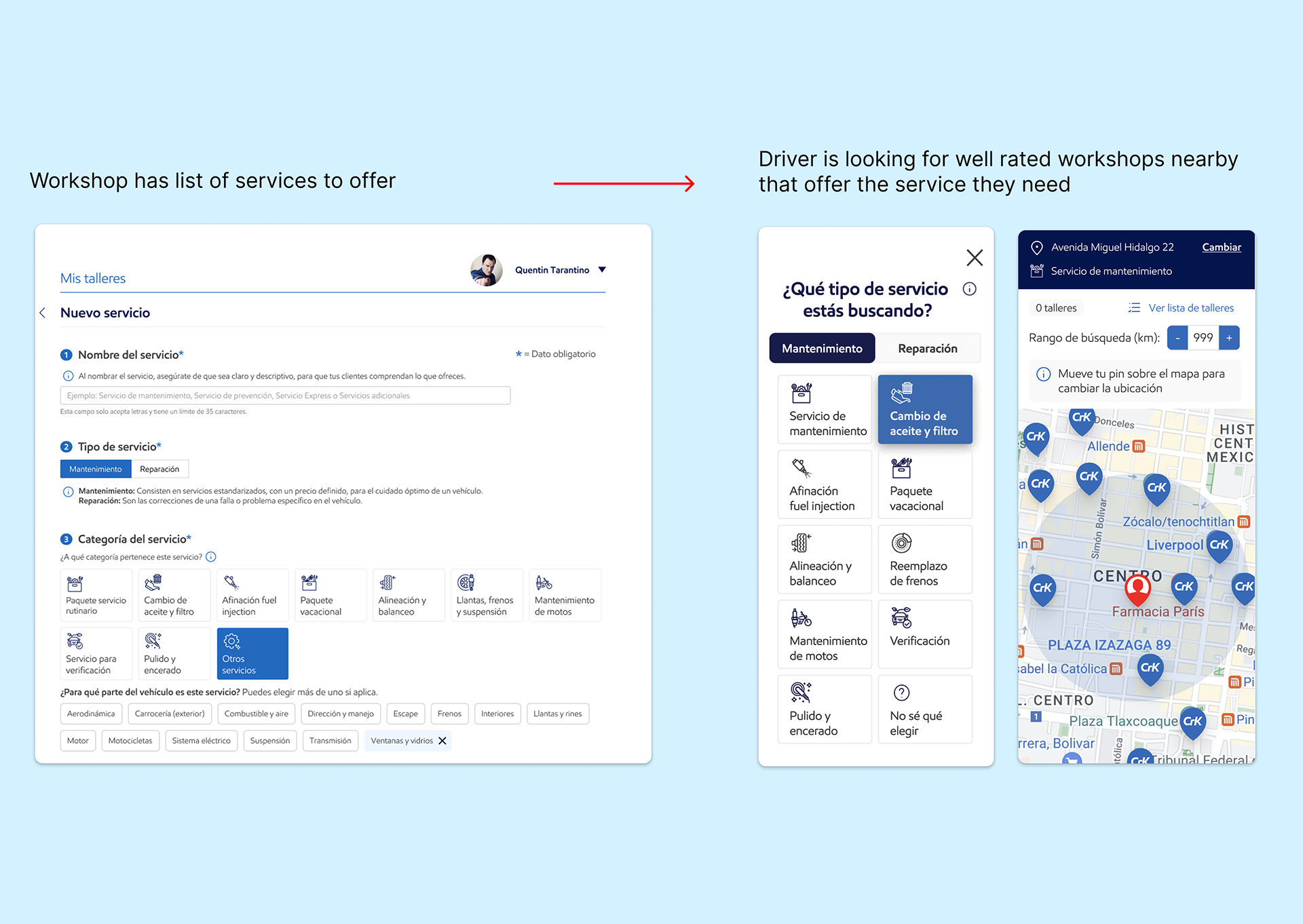
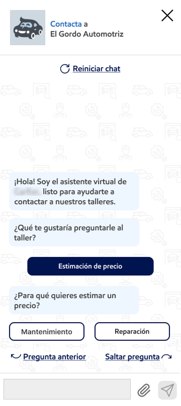
Constraints & Trade-offs
• Wide diversity of workshop sizes and setups (from small informal shops to large chains)
• Low tolerance for workflow disruption
• Tight deadlines and limited resources
• No fully established design system at project start
Key Trade-off:
We focused on reducing complexity and friction, even when that meant postponing more advanced digital features that could increase cognitive or operational load.

The main value features that where highlighter to users were distance, ratings and traceability of their car's status from their phone,  which all translated into a higher sense of trust.

Research was conducted using two complementary approaches, as workshops and end users represented very different profiles and needs.
Research Methods
1. Unmoderated virtual sessions (UserTesting) to test end consumer flows
2. Moderated in-person sessions with workshops
Some behaviors, including space usage, multitasking and tool accessibility, could only be understood on location, making in-person research essential.
Key Insights
Across workshop types, several common patterns emerged:
• Workshops have very limited time to adopt or learn new tools
• Digital tools are often perceived as friction unless they provide immediate value
• Workflows rely heavily on paper and pencil due to speed, flexibility, and physical conditions (e.g. greasy hands)
Adoption only happens when a tool fits existing routines, not when it asks users to change them
These insights directly informed product and design decisions.

Using digital tools only as a complement to exiting workflows, making sure they were very quick to use since workshop employees need to multitask to fulfill their duties , was a key aspect of this redesign.

Design Strategy & Key Decisions
Simplifying Complexity
The core UX/UI effort focused on stripping functionality down to its essential components, removing distractions and unnecessary steps.
However, simplification was not applied indiscriminately. In some cases, research revealed that missing information or components were actually increasing confusion.
Each change was evaluated against:
• Usability heuristics
• Design principles
• Best practices and benchmarks
Adapting to Traditional Workflows
Rather than forcing full digital adoption, we chose to work with existing behaviors.
Key Decision: Paper-Friendly Flow
• Workshops could scan and upload diagnosis sheets
• Digital entry remained optional rather than mandatory
This allowed:
• Flexibility across different levels of digital maturity
• Centralized tracking without disrupting established routines

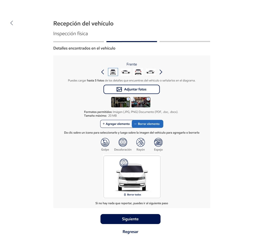
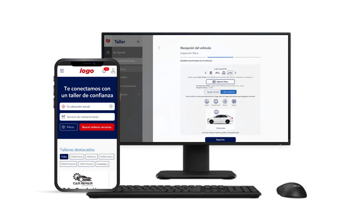
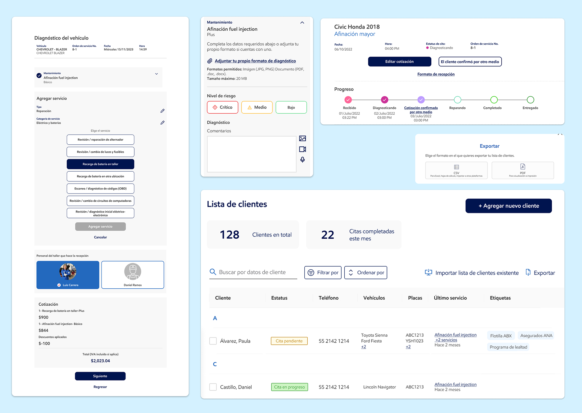
All parts of the reception and diagnosis process for vehicles included the ability to complete the steps digitally or to upload pictures or existing paper and pen forms so that workshops could have greater flexibility in sharing these steps in a timely and complete manner with their customers.

Feature Proposal: Service Finder Chatbot
One major usability issue for end users was not knowing what was wrong with their car or how to describe the problem. They also had issues with the complex, time consuming step-by-step forms pattern that was previosly being used to book services with workshops.
Solution Proposed: A chatbot acting as a decision tree
• Guided users through booking without requiring technical car knowledge or a lot of complexity to request a service.
• This reduced anxiety, improved clarity, and made the platform feel more approachable.
Opportunity to scale into a more powerful AI tool that helps users identify potential car issues based on a brief description or selected symptoms, and more accurately match them with workshops by filtering for those that offer the required services..
This chatbot feature guides users to help them select the service their vehicle needs. It asks a structured series of questions to identify the appropriate service and request a quote from the workshop. For more complex issues, it helps users articulate the right questions and information so the workshop can diagnose and assist them effectively.
UI System Challenge & Resolution
Mid-project, a branding change required a full UI refresh.
Challenges
• No comprehensive design system
• Inconsistent Figma files with non-componentized elements
• Tight deadline
Resolution
• Collaborated with newly onboarded designers
• Cleaned up existing files
• Built a scalable UI Kit as a foundation (with the intent to expand later)
This allowed the team to:
• Support the rebrand efficiently
• Return focus to functional simplification and feature desi

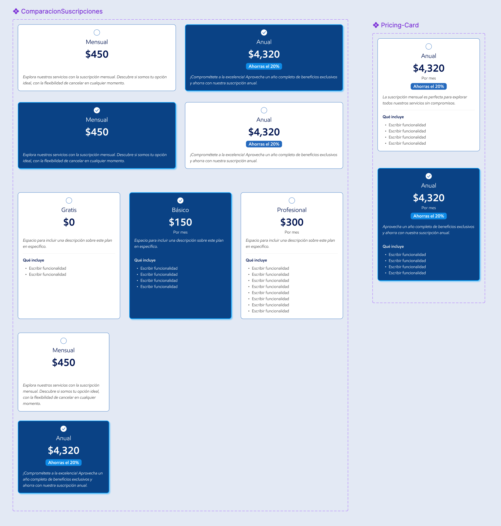
The components created for this design system were structured from the most complex to the most minimal variations, with built-in flexibility across different screen resolutions. This approach established a strong, scalable foundation that supports future style updates and functional changes without requiring a full redesign.

Collaboration & Process
For most of the project, I handled both UX/UI design and user research independently, which required balancing execution and analysis.
Responsibilities
•  Conducted usability testing
•  Designed and iterated UI flows
• Acted as main design liaison between product and development
As the team expanded, collaboration increased significantly:
• Research and design responsibilities became more distributed
• Design critiques and shared problem-solving improved solution quality
• The team worked in an Agile methodology, with strong communication and alignment across roles.

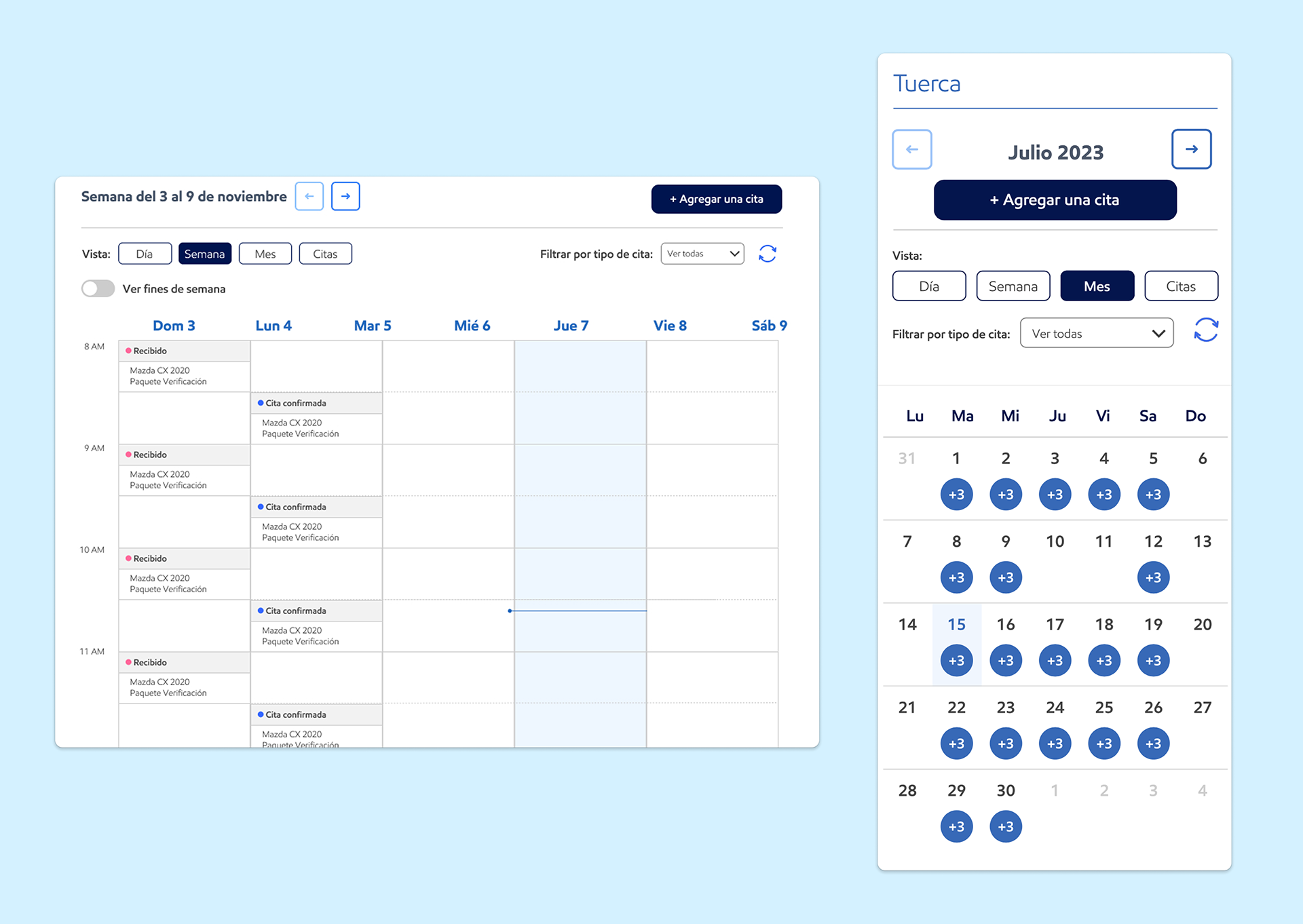
One important functionality for workshop owners was the ability to view all their appointment (weekly, daily, and monthly) and switch between these views quickly and seamlessly, both on desktop and mobile.

Stakeholder Communication & Impact
Presenting research findings in business-relevant language was a critical part of the process.
In close collaboration with the Design Manager:
• Insights were framed around business goals and risk reduction
• Findings were kept concise and actionable
• Research outcomes were tied directly to product decisions
This approach helped secure stakeholder buy-in for:
• Design improvements
• Additional user research
• Validation of new user stories and business initiatives

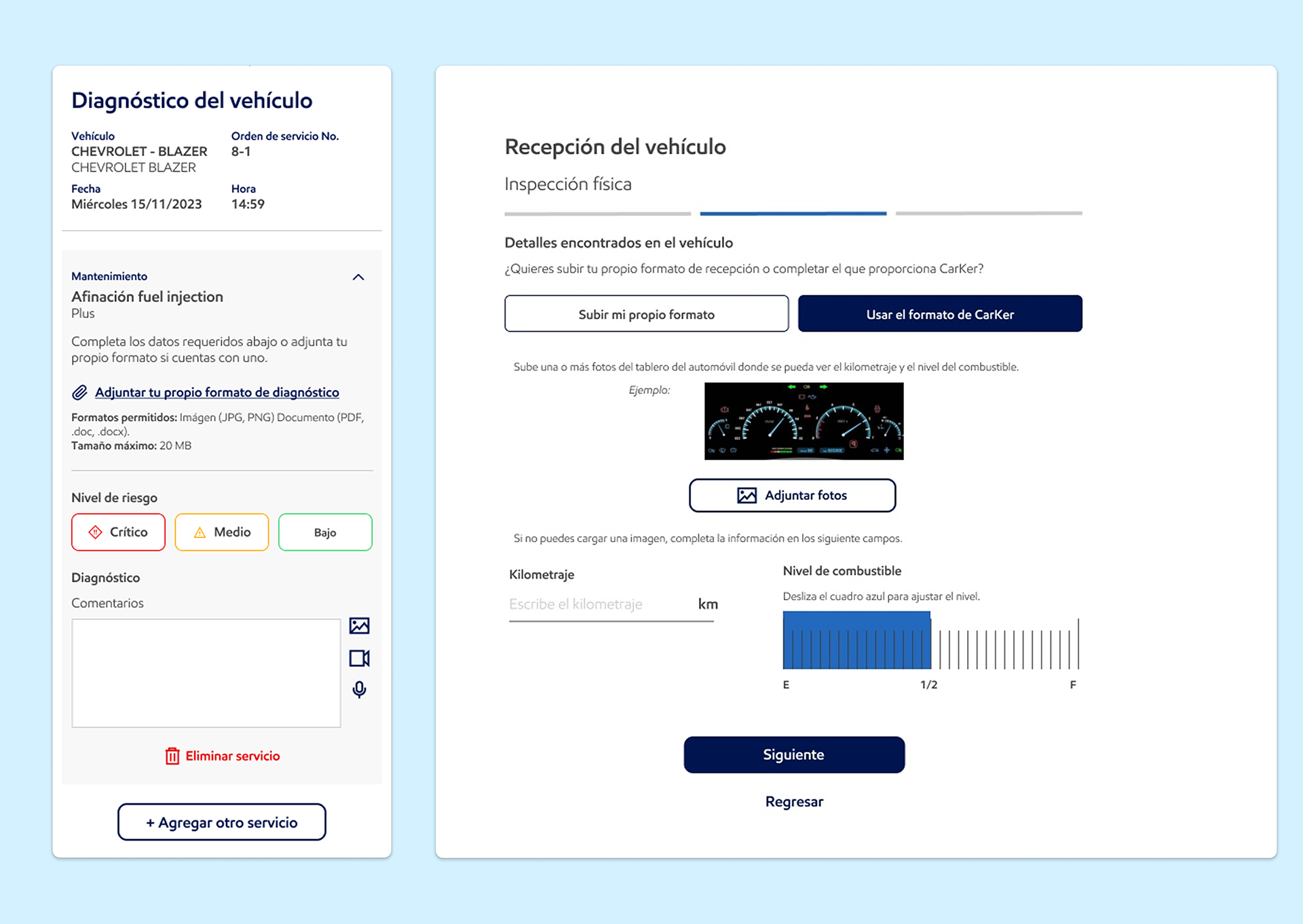
Features for workshops were intentionally re-designed to be simple to set up initially and easy to operate on a day-to-day basis. Both screens in this image show user flows where the workshop can attach their own reception or diagnosis formats, or fill out the required information through the buttons, sliders and text boxes provided.

Reflection
This project reinforced that modernizing a workflow doesn’t mean replacing it entirely. True adoption happens when digital tools respect existing routines and quietly remove friction rather than introduce new complexity.
Balancing UX design, research, and cross-functional communication under real constraints proved challenging, but ultimately rewarding, and led to more grounded, effective product decisions.
What I'd do differently: 
When I was onboarded onto this project, it was made up of many overcomplicated features. It felt like, in an attempt to create value, the initial focus had been on adding more and more functionality rather than continuously refining the core features users actually needed. As a result, the product ended up with a large number of features but only superficial value, rather than a few key features delivering profound, meaningful impact.
For products built from scratch, I believe it’s critical to solve one main problem exceptionally well before trying to address multiple smaller ones. Offering many tiny solutions that don’t truly move the needle dilutes focus and weakens the overall value proposition.
A complete focus on crafting an excellent core solution creates far more value than layering on unnecessary bells and whistles. Those additions often distract both the product team and the end user, who may struggle to understand what the real value is within an ocean of proposed solutions.
Validating the user’s primary problem is the first and most important step in building a product that genuinely improves their everyday life.​​​​​​​
Back to Top