
Case Snapshot
Product: Mobile banking application
Client: Bank traditionally focused on military personnel
Users: Core user- Military personnel Target users- Current client and potential new market segments of a civilian and younger demographic
Role: UX & UI Designer
Timeline: Multi-sprint project
Team: UX, UI, User Research, Business stakeholders (multicultural LATAM team)
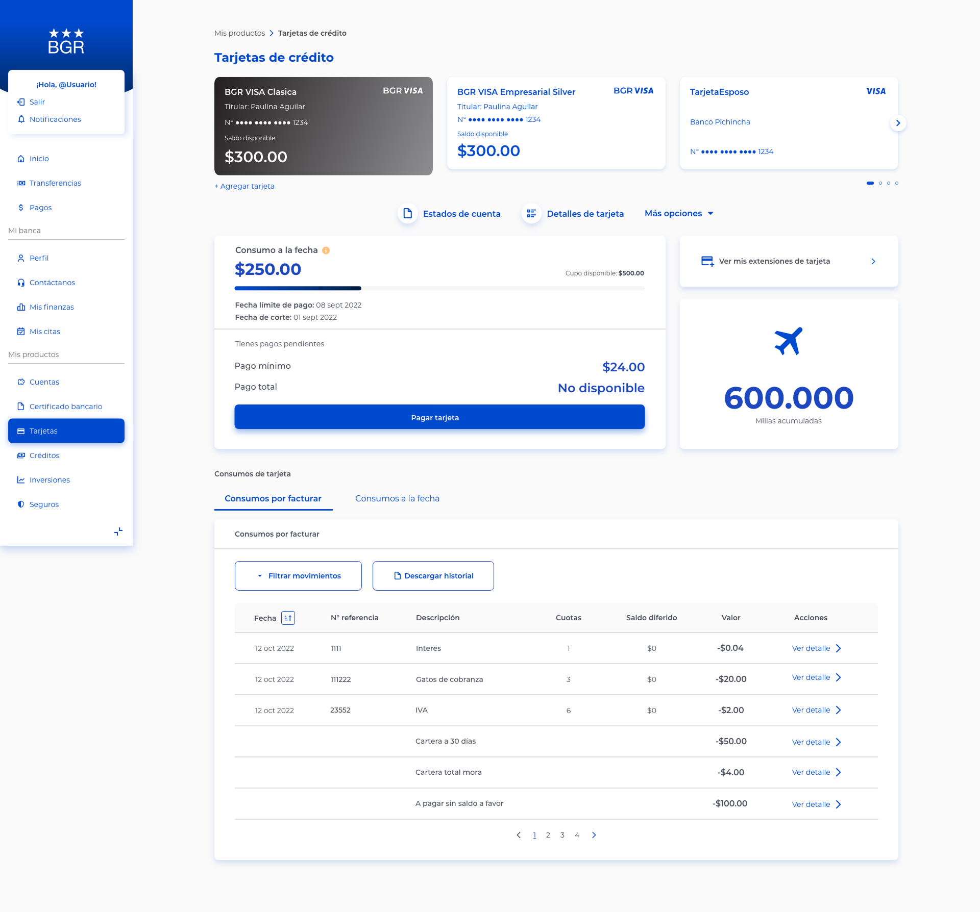
Platform: Mobile (iOS & Android) & desktop online portal access

Problem: The bank needed to expand its customer base beyond military personnel without alienating its core users, while modernizing both the product experience and brand perception.
Outcome: Redesigned key flows and UX structure, supported a full visual rebrand, and proposed product features aligned with modern mobile banking expectations.
Product lens: This project influenced the roadmap by transforming the general look and feel and capabilities of the bank's mobile banking platform to attract potential users that extend beyond their niche army personnel client, by implementing a design that feels fresh and functionalities that bring value to any everyday banking client.
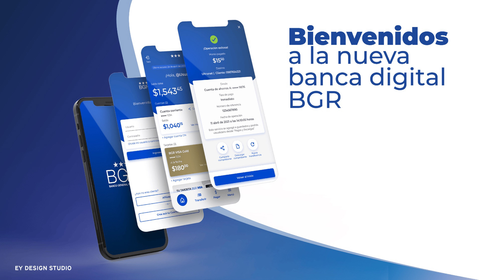
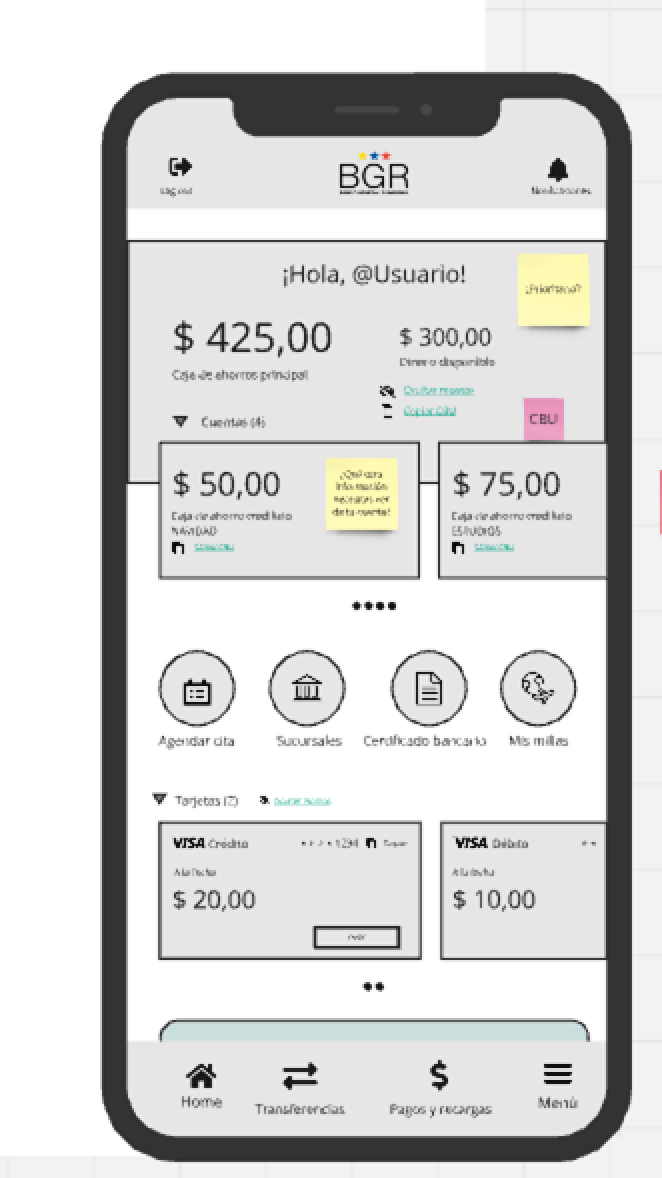
Image translation: Welcome to BGR's new mobile banking platform
The Problem & Why It Mattered
The bank had a strong, loyal customer base within the military sector but faced limitations in growth due to narrow market perception. Younger users and the general public perceived the institution as “not for them,” which restricted adoption.
To remain competitive, the bank needed to:
• Broaden its appeal without losing trust from existing users
• Offer features comparable to leading banks locally and globally
• Deliver a modern, intuitive mobile experience aligned with current user expectations
This made the project both a product and perception challenge.
Success Metrics:
• User flows with passing-grade evaluations in usability tests
• Client effort index
• Completed redesigns to solve problems detected in usability testing
• Screens and user flows approved by client
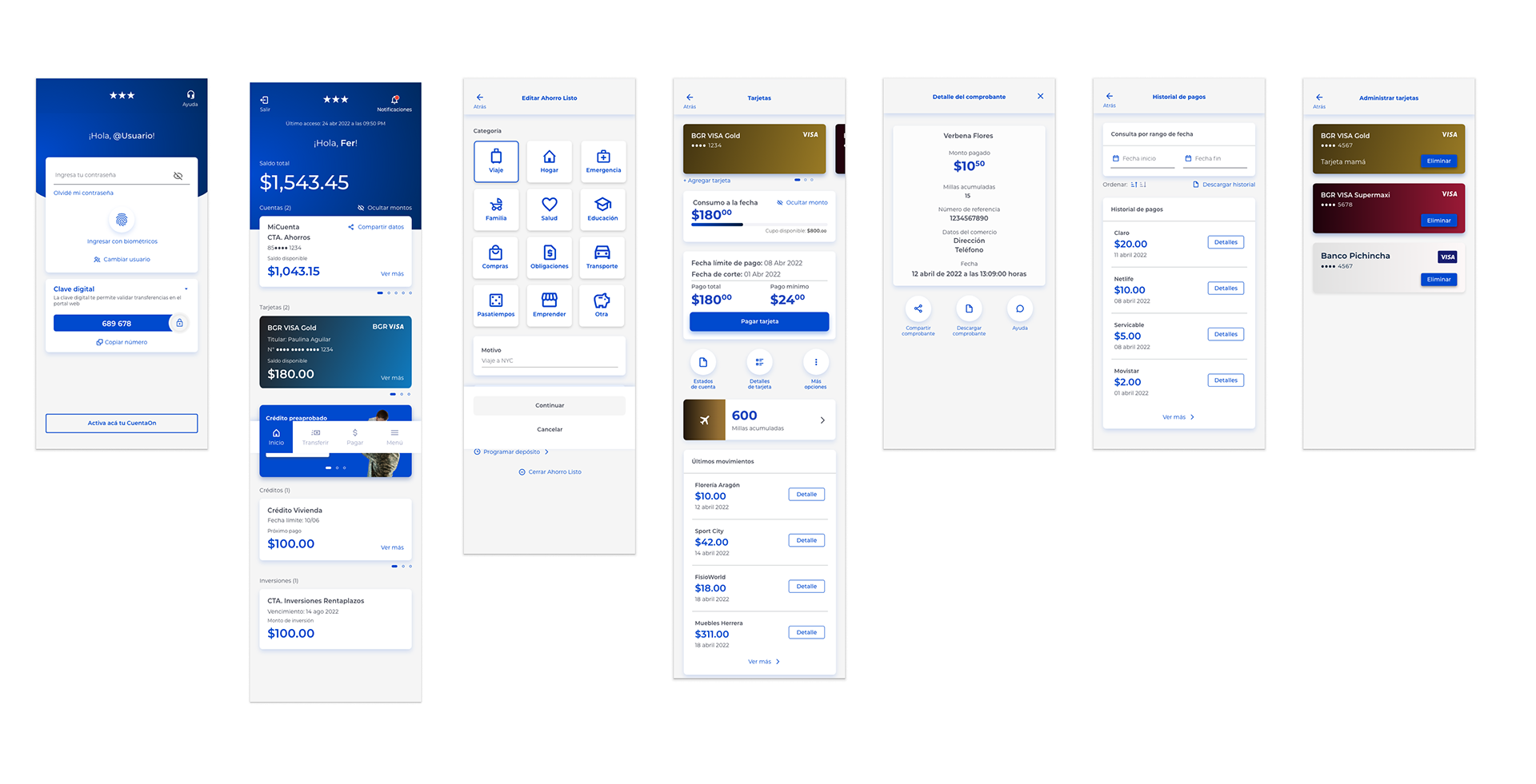
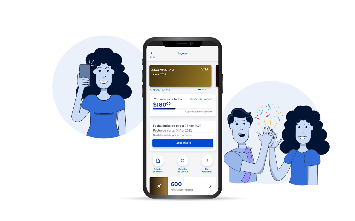
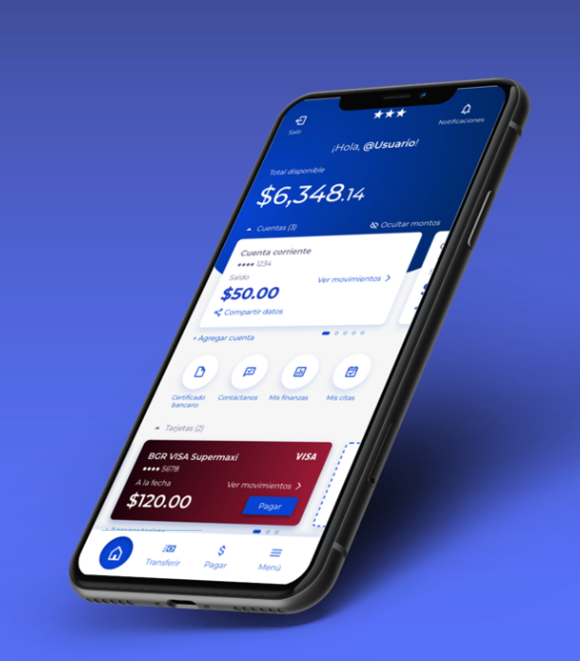
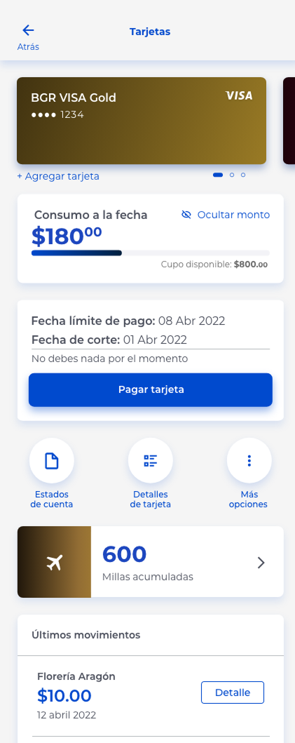
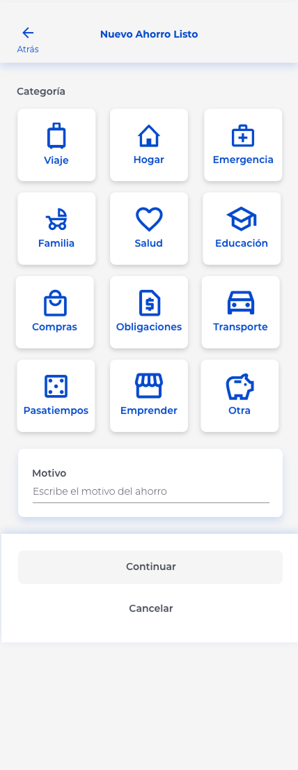
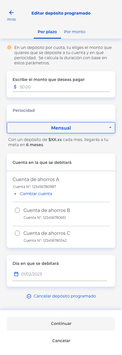
Selected screens from key user flows including log-in, informational and transactional.
Constraints & Trade-offs
Constraints:
• Existing core users with specific needs and expectations
• Regulatory and security requirements inherent to banking products
• Need to align UX changes with a simultaneous rebrand
Key Trade-off:
We aimed to modernize and simplify the experience while avoiding changes that could disrupt familiar workflows for long-time users.
We aimed to modernize and simplify the experience while avoiding changes that could disrupt familiar workflows for long-time users.
Design was approached through a mobile first strategy and was then adapted to other screen resolutions.
Research & Discovery Inputs
Although user research was conducted by a dedicated research team, UX design was tightly integrated with research insights.
Inputs Included:
• Listening in on remote usability testing sessions
• Participating in user research debriefs
• Reviewing qualitative insights from testing interviews
These inputs informed decisions throughout wire-framing, flow definition, and prototyping.
Insights from user reasearch where used in the ideation phase of user flow designing and where then polished with the final UI look and feel.
Benchmarking & Product Exploration
To define features that could attract a broader audience, we conducted extensive benchmarking across:
• Leading banks in Ecuador
• Digital banks across Latin America
• Global mobile banking products
This benchmarking phase gave the team creative and strategic freedom to propose features that aligned with:
• User expectations
• Business growth goals
• Market standards
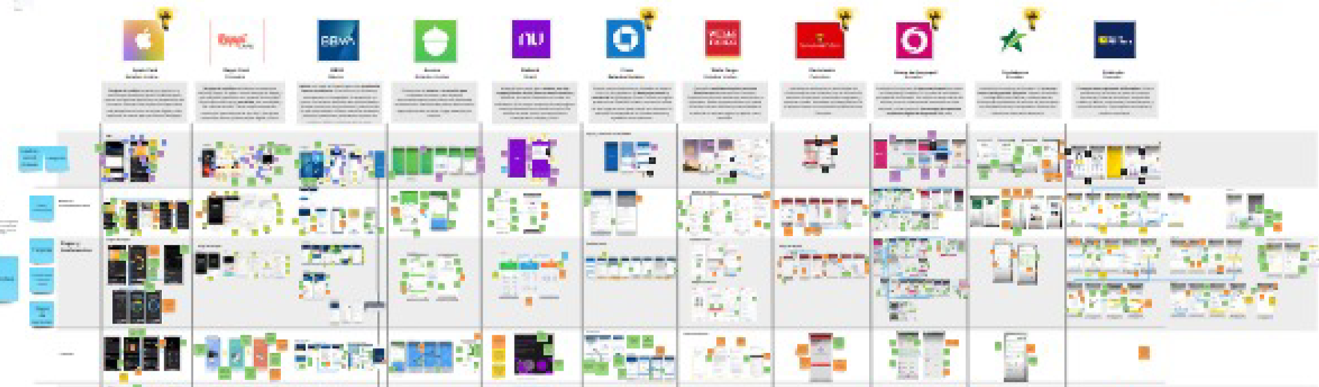
Benchmarking involved a thorough analysis of what worked, what didn't and what was desirable concerning features and layouts found on key banking and financial apps in Ecuador, Latin America and internationally. A perspective that went from local to global was key to broaden the vision of what was possible.
UX Strategy & Design Approach
From a UX standpoint, the main focus was on creating:
• Clear, intuitive navigation
• Complete end-to-end flows
• Feature discoverability without overwhelming users
Key UX Responsibilities
Wire-framing new flows based on user stories defined by business and design leadership
• Defining primary user journeys across the app
• Designing UX for final screens and interactions
• Prototyping key flows for validation and alignment
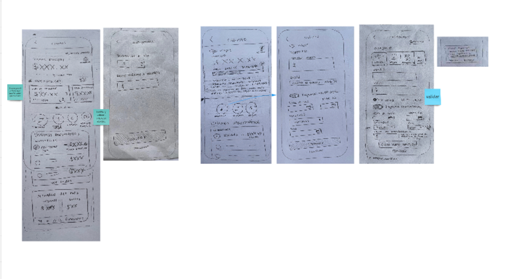
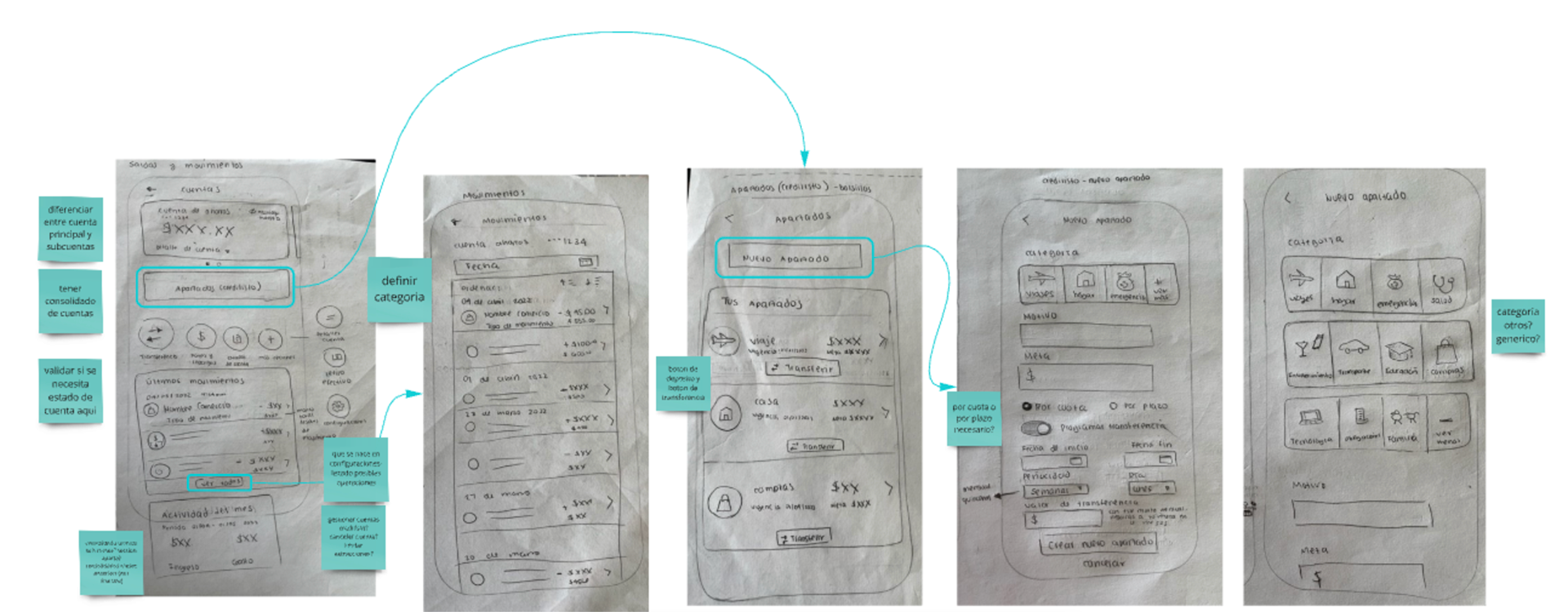
The design process consisted in sketching low fidelity first by hand and then wire-framing the screens digitally based on key functionality and layout findings discovered during benchmarking.
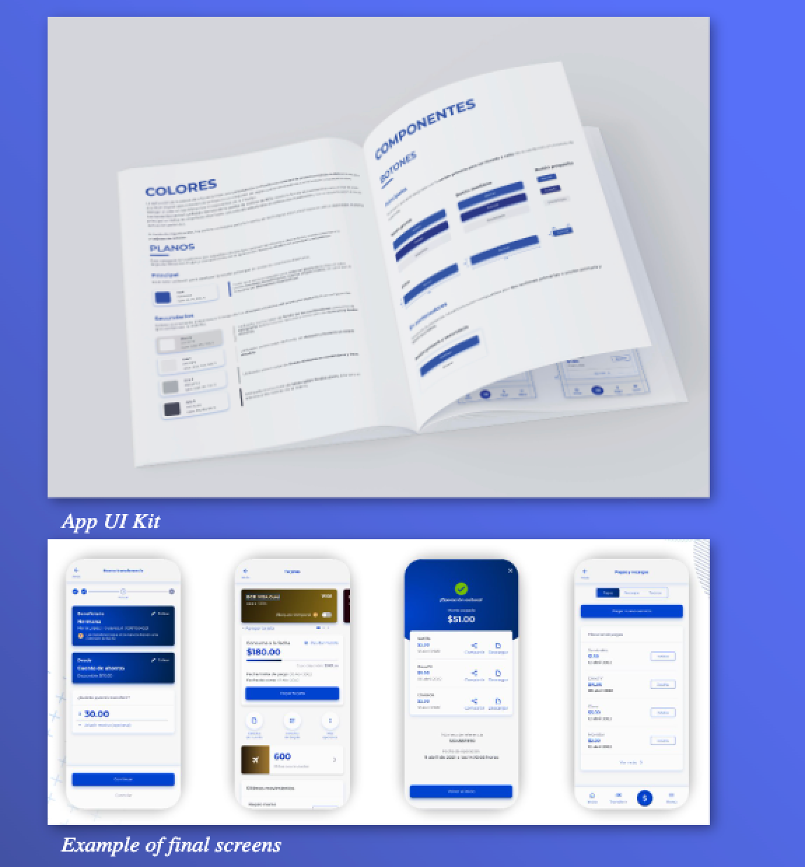
UI Collaboration & Design System Work
A fresh visual direction was required to support the repositioning of the bank. The UI team leaders proposed a neumorphism inspired design language, which became the foundation for the new look and feel.
Collaboration Highlights:
• Close coordination with UI designers on component behavior and structure
• Contribution to component creation and UI Kit development
• Ensuring UX clarity and accessibility within the new visual style
• UX, UI, and research worked in parallel, with frequent alignment to ensure consistency across design decisions.
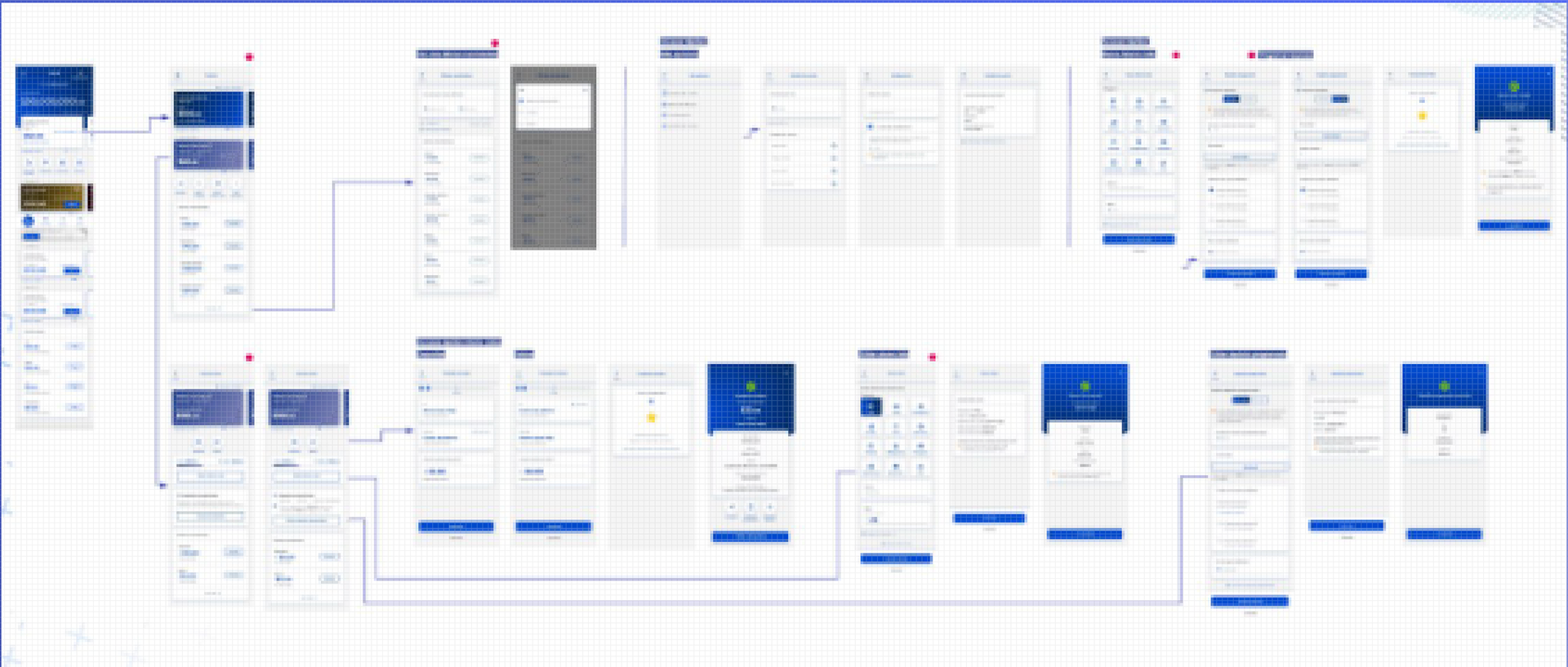
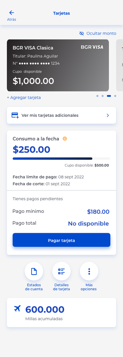
Example of user flow diagram using high fidelity screens
Process & Team Collaboration
The project was executed in Agile sprints, with a strong emphasis on collaboration and transparency.
Ways of Working
• Cross-functional collaboration between UX, UI, research, and business
• Minimal silos between disciplines
• Sprint retrospectives to identify improvements and apply learnings continuously
This high level of integration enabled fast iteration and smoother handoffs across teams.
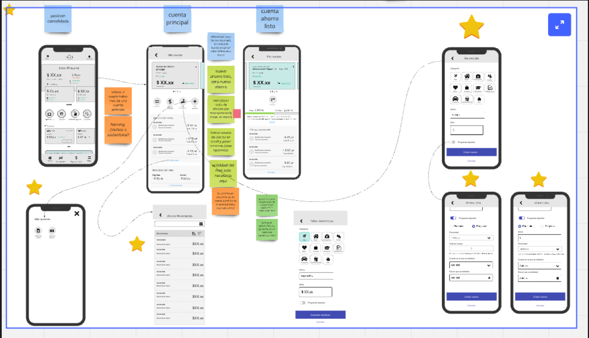
Collaborative wireframing and feature functionality brainstorming sessions were imparted using virtual tools like Miro and Mural since the team was located in different cities across Latin America.
Reflection
Working in such a connected and collaborative environment proved critical to the project’s success. The constant exchange between UX, UI, research, and business ensured that design decisions were informed, aligned, and adaptable.
This project reinforced the importance of:
• Designing for multiple user groups with different expectations
• Aligning brand, UX, and product strategy
• Maintaining open communication in complex, interdependent projects
What I'd do differently:
For other redesign projects, leveraging a design system with the fundamental building blocks is key for more efficient and agile work process. Having this from the start instead of only relying on a UI Kit allows for a faster and more cohesive design of all the screens that make up the user flows, since a UI Kit limited us when it came to making global changes and impacted in the time it took us to implement them throughout all screens.
This project was part of a bigger initiative to redesign the digital channels of this Ecuadorian Bank by EY Design Studio Latam. You can read more about the whole scope here: https://www.ey.com/es_py/insights/financial-services/ey-optimiza-experiencia-usuarios-canales-digitales-bgr