Case Snapshot
Product: Timeshare program prospecting and signing process for a hotel chain in South America
Role: UX/UI Designer & Researcher
Team: 2 UX/UI designers, legal team, business stakeholders
Timeline: Multi-phase project
Users: Hotel guests prospected for a timeshare program

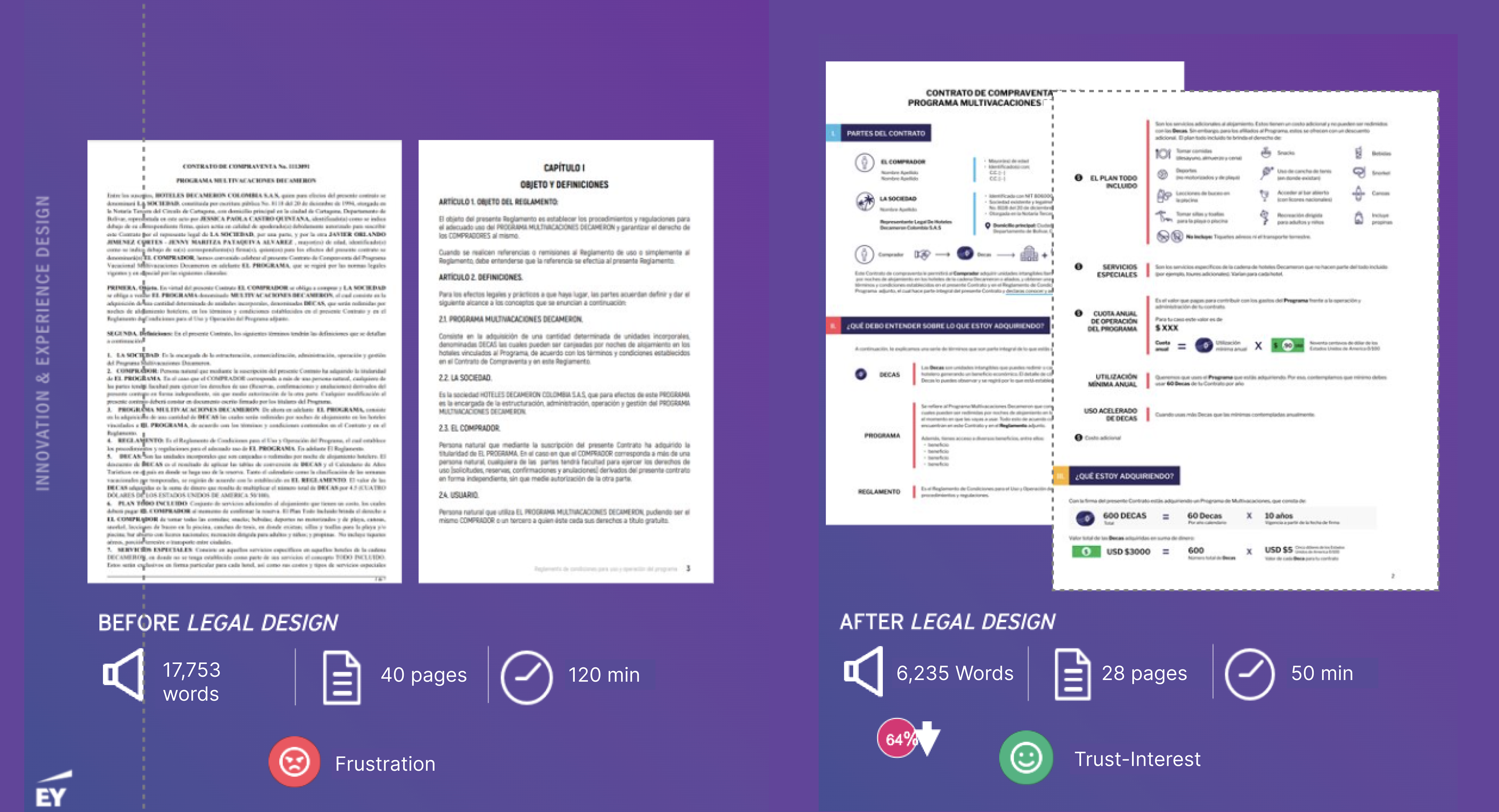
Overview of contract redesign for a better and faster comprehension by prospective clients.

ProblemThe timeshare sign-up experience was perceived as long, aggressive, and difficult to understand, resulting in low trust and high drop-off.
Outcome Redesigned legal documentation using legal design principles and identified key opportunities to improve the prospecting experience, making the end-to-end journey clearer, friendlier, and more transparent.
Product lens:
This project impacted the roadmap by adopting a user centric approach to a process that is typically filled with pain points across its end-to-end experience: the acquisition of a tourism hospitality program. By making the journey more intuitive, transparent, and enjoyable, the hotel chain gained a competitive advantage and increased its chances of converting prospects into program members by fostering trust, transparency and simplicity for customers.
The Problem & Why It Mattered
Legal design aims to make complex legal information accessible and understandable to people without legal training. In this project, there were two main challenges:
1. The contract and rulebook were dense, jargon-heavy, and time-consuming to review
2. The prospecting experience felt aggressive and overly demanding of guests’ vacation time
As a result:
• Potential clients felt overwhelmed and suspicious
• Many declined to engage further with the program
• Trust broke down before users could understand the value of the offer
• Improving comprehension and tone across the entire journey, from first contact to signing, was essential to increase conversion.

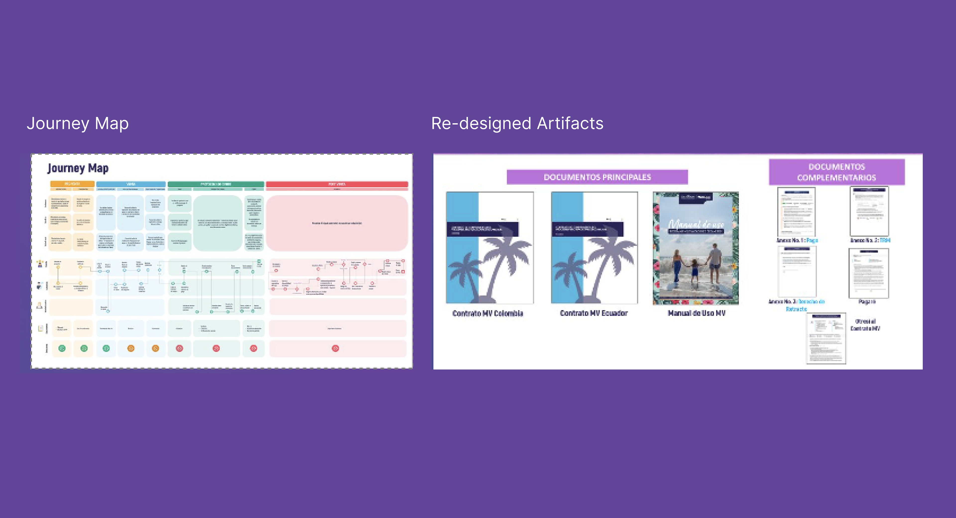
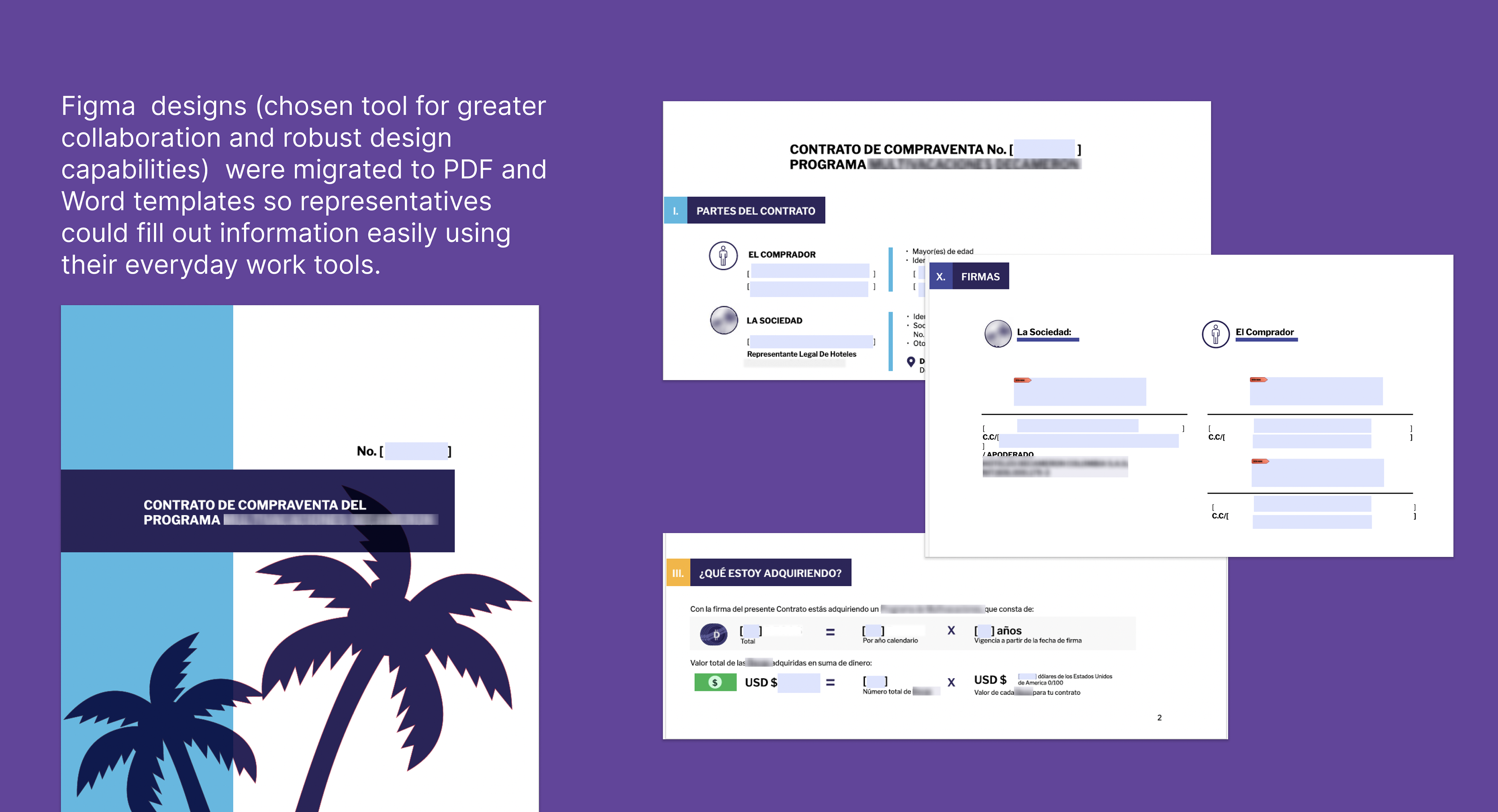
Deliverables included a journey map exposing fricition points in the prospecting process and redesign of legal artifacts, which included a signing contract, user handbook and complementary legal documents used during timeshare enrollment.

Project Scope & Focus Areas
The project was divided into two parallel focus areas:
Legal Design
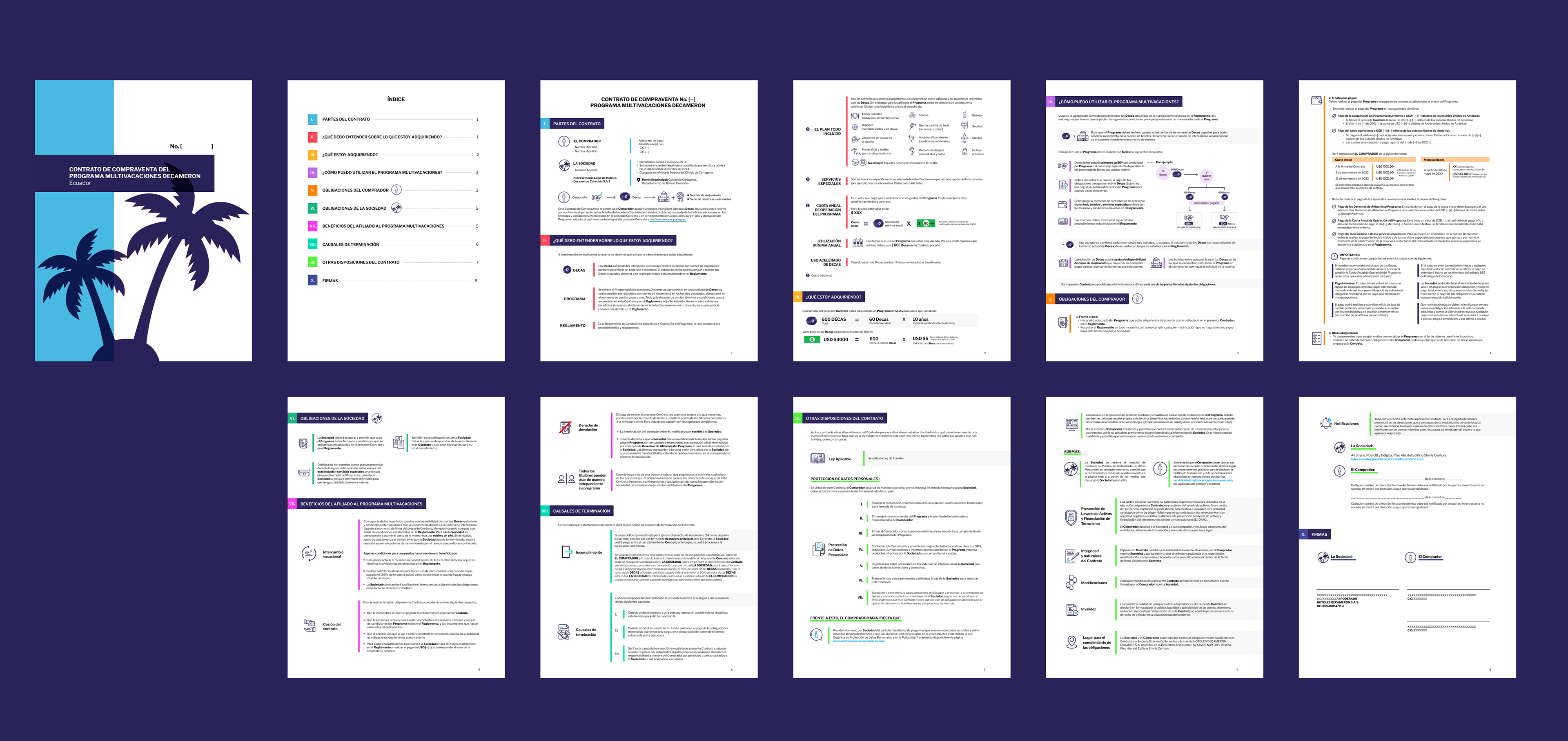
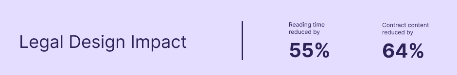
Redesigning the contract and rulebook to improve clarity, readability, and comprehension.
Prospecting Experience Audit
Evaluating how hotel guests were approached and guided through the sales process.
Both efforts aimed to reduce friction and build trust.
My Role & Collaboration
I worked as a UX/UI Designer and Researcher, alongside another designer in the same role.
Responsibilities
•Designing and executing user research tools
• Conducting legal design analysis and redesign
• Auditing the prospecting experience
• Defining visual information design principles
• Collaborating closely with legal experts to adapt language
Work was divided intentionally to meet deadlines efficiently while maintaining alignment across both focus areas.

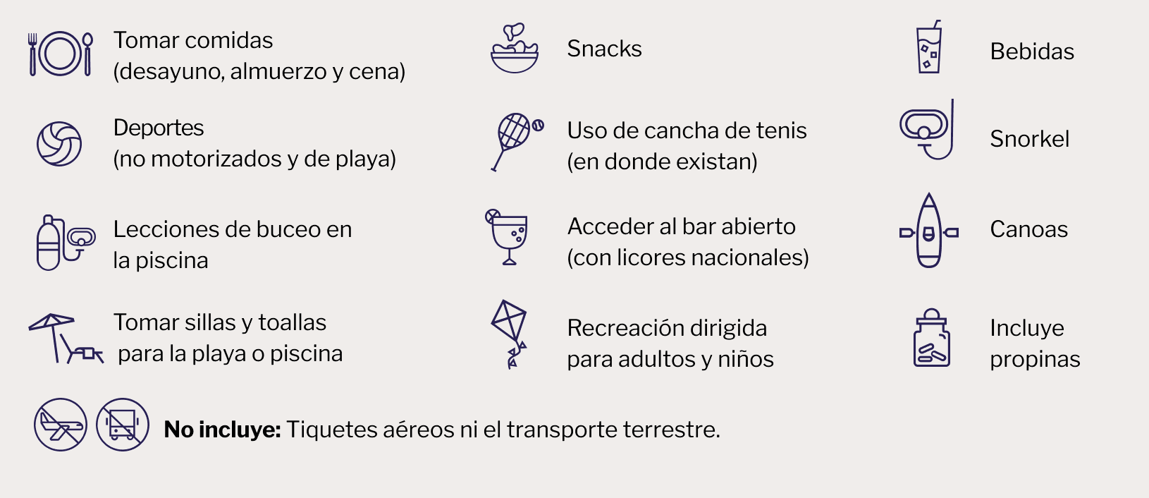
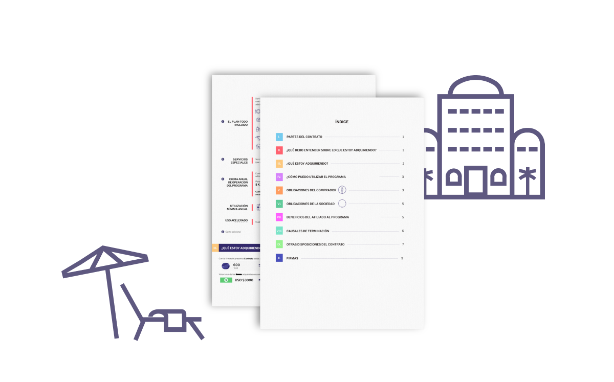
Bespoke icons designed to better communicate all the services included (and not included) in the timeshare program.

Research Strategy & Methods
Legal Design Research
To evaluate the “as-is” state of the contract, we used a methodology titled "Between the Lines", a usability testing method designed to assess comprehension of written documents. Users highlight, using a color code, content they find important and content they don't understand.
Metrics Observed:
• Time required to read the contract
• Areas of confusion or misunderstanding
• Cognitive load and user frustration
This allowed us to identify specific sections where comprehension broke down, helping us focus design efforts where they mattered most.
Prospecting Experience Research
In parallel, we designed research tools to audit the prospecting experience:
• Interview guides for hotel guests who had been prospected
• Mystery shopper exercises, where we experienced the process firsthand
• This dual approach helped us understand both perception and reality of the sales flow.
Key Insights
From Legal Design Research
• Users struggled to understand what they were signing
• Legal language felt tangled and inaccessible
• Time pressure prevented meaningful review, reducing trust
From Prospecting Research
• Guests felt the approach was aggressive and overly demanding
• Many feared being pressured or “tricked” into signing
• The process felt like a large commitment just to hear the pitch
Together, these insights revealed a lack of psychological safety throughout the journey.

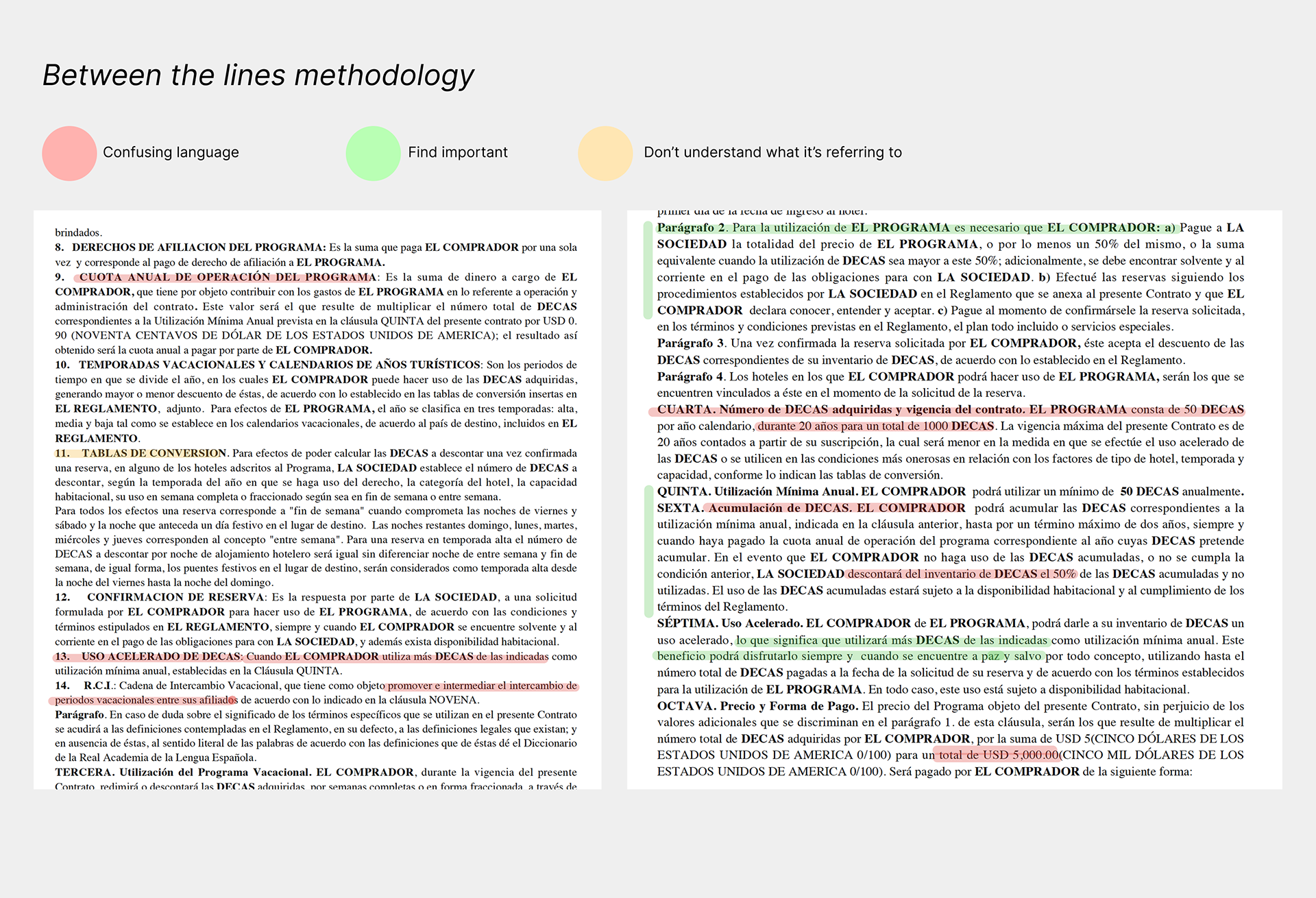
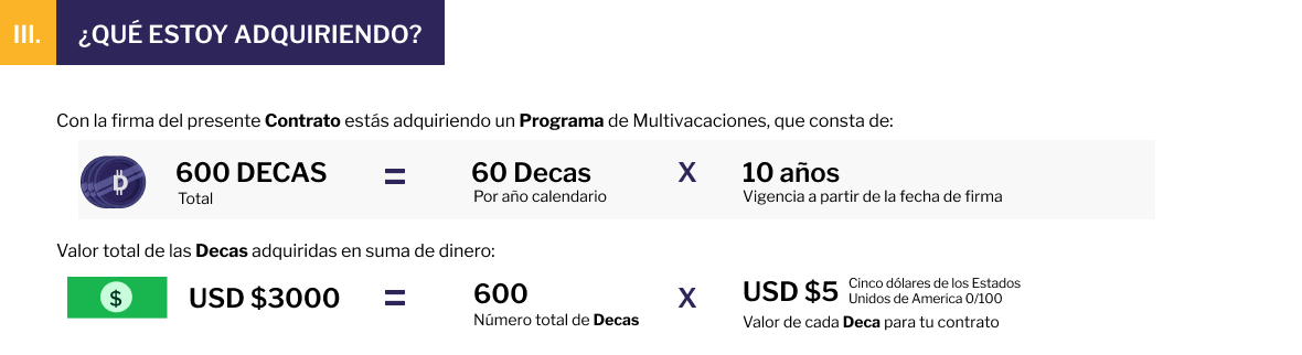
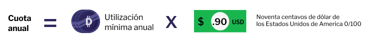
One key pain point that the hotel chain wanted to fix was that many of their prospects didn't understand the currency system that they operated by for clients to purchase nights in their hotel chain's different locations. Information design principles were leveraged to simplify the way information was shown so users could understand quickly how the program worked.

Design Strategy & Key Decisions
Legal Design Intervention
We redesigned the contract and rulebook using legal design principles:
• TL;DR summaries to surface key information upfront
• Visual hierarchy and information chunking
• Clear, conversational language developed with legal experts
• Reduced cognitive load while preserving legal accuracy
The goal was to let users focus on meaning, not deciphering language.

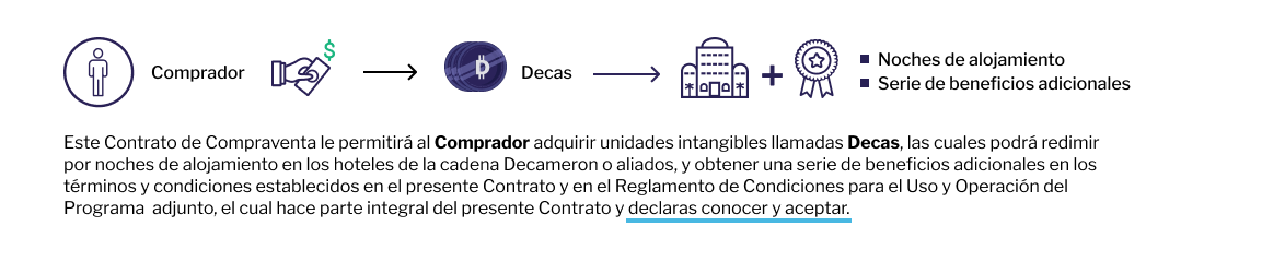
Diagrams were designed as a visual complement to the information shown on legal documents and the handbook, providing clients with a fast snapshot to help them understand quickly what the textual information referred to. 

Workflow & Tooling Decisions
Design work was done in Figma and adapted into Word templates, allowing:
• Easy editing by operational teams
• Fast customization per client (personal data, packages)
• Accessibility for teams using only Microsoft tools
This ensured adoption beyond the design phase.

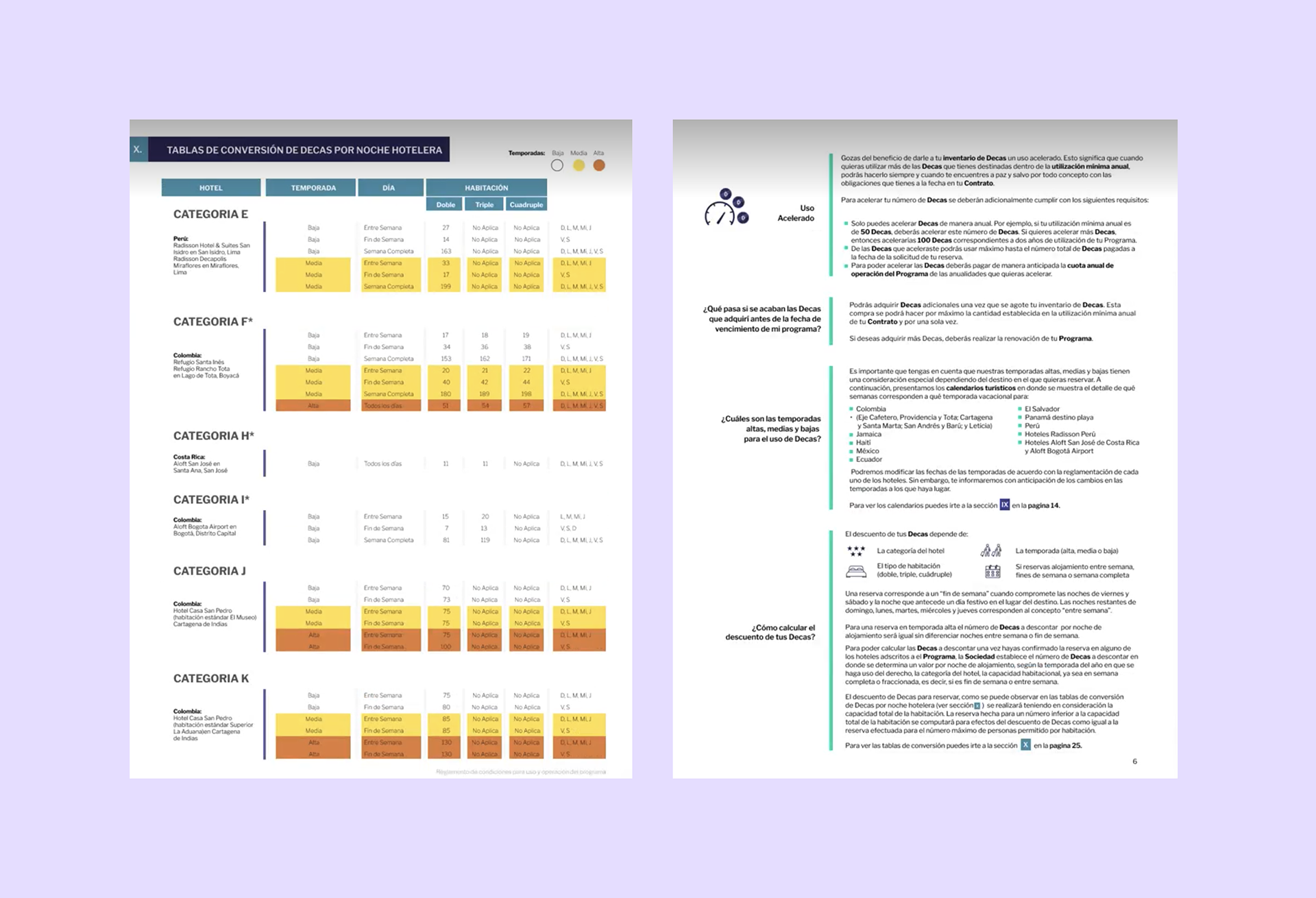
Making tedious legal contracts digestible was achieved through using basic design elements, like color, shapes, icons and information segmentation.

Changes Proposed & Results
Proposed Improvements:
• Redesigned legal documents (mockups)
• Clearer prospecting scripts and experience recommendations
• Friendlier, lower-pressure entry points into the program
Results:
• Improved user comprehension and confidence when reviewing contracts
• Reduced feelings of pressure and confusion
• Stronger alignment between product value and user understanding

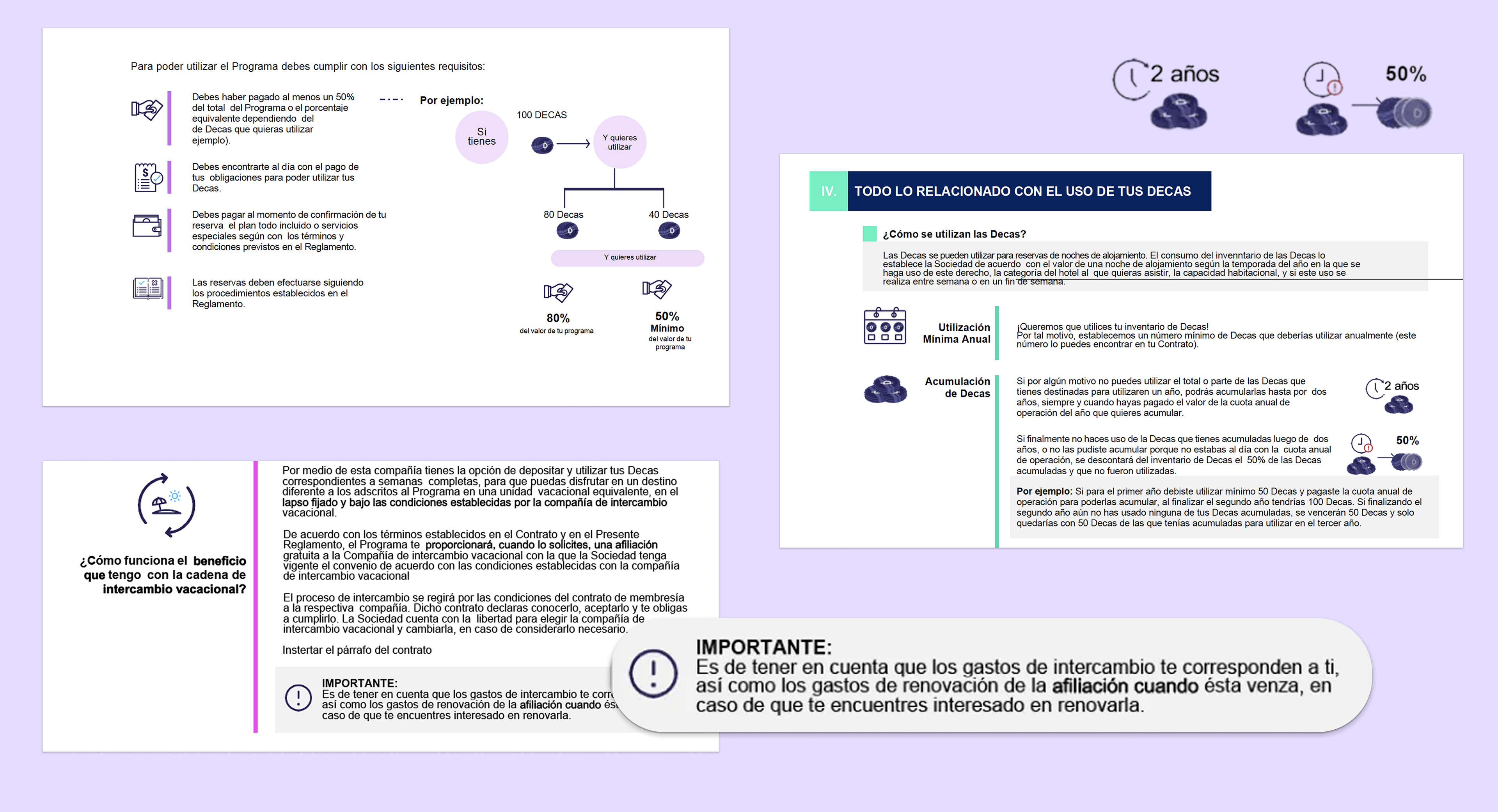
Through legal design, complex information was broken down and represented visually for a clearer understanding of it by users.

Validation & Iteration (for future phases)
While this phase focused on redesign and auditing, we identified opportunities for future iteration:
• Introducing interactive or digital formats for progressive disclosure
• Combining legal information with visual and AR-based previews of timeshare benefits
• Creating a more cohesive experience between prospecting, explanation, and signing
These ideas aimed to further reduce friction and increase understanding.
Reflection
Through legal design and a deep understanding of the prospected user journey, we were able to transform a previously intimidating experience into one that felt clearer, more respectful, and more human.
This project reinforced that:
• Visual and information design are critical in legal contexts
• Trust is built through clarity, not persuasion
• Cross-functional collaboration, especially with legal experts, is essential in legal design
By centering users’ understanding and time, the experience shifted from something to avoid into something users could engage with confidently.
What I'd do differently:
At the beginning of this engagement, we began with legal design based on the results of our research methodologies and visual design best practices. However, once we evaluated the prospecting process in-site, we uncovered some other insights which impacted our design work. For other redesign projects, I believe it is vital to have a full understanding of the context in which design artifacts will be used before jumping into the final design phase.


Back to Top